


Bankbrokers are an independent global banking and merchant services consultancy with offices throughout Europe and the US. Following a strong period of international growth, the brand’s identity became more important than ever.


Our Approach
Through discovery sessions with the Bankbrokers’ international leadership team, including members from the UK, Norway and Denmark, we unpicked what made them different and their unique position in the market.
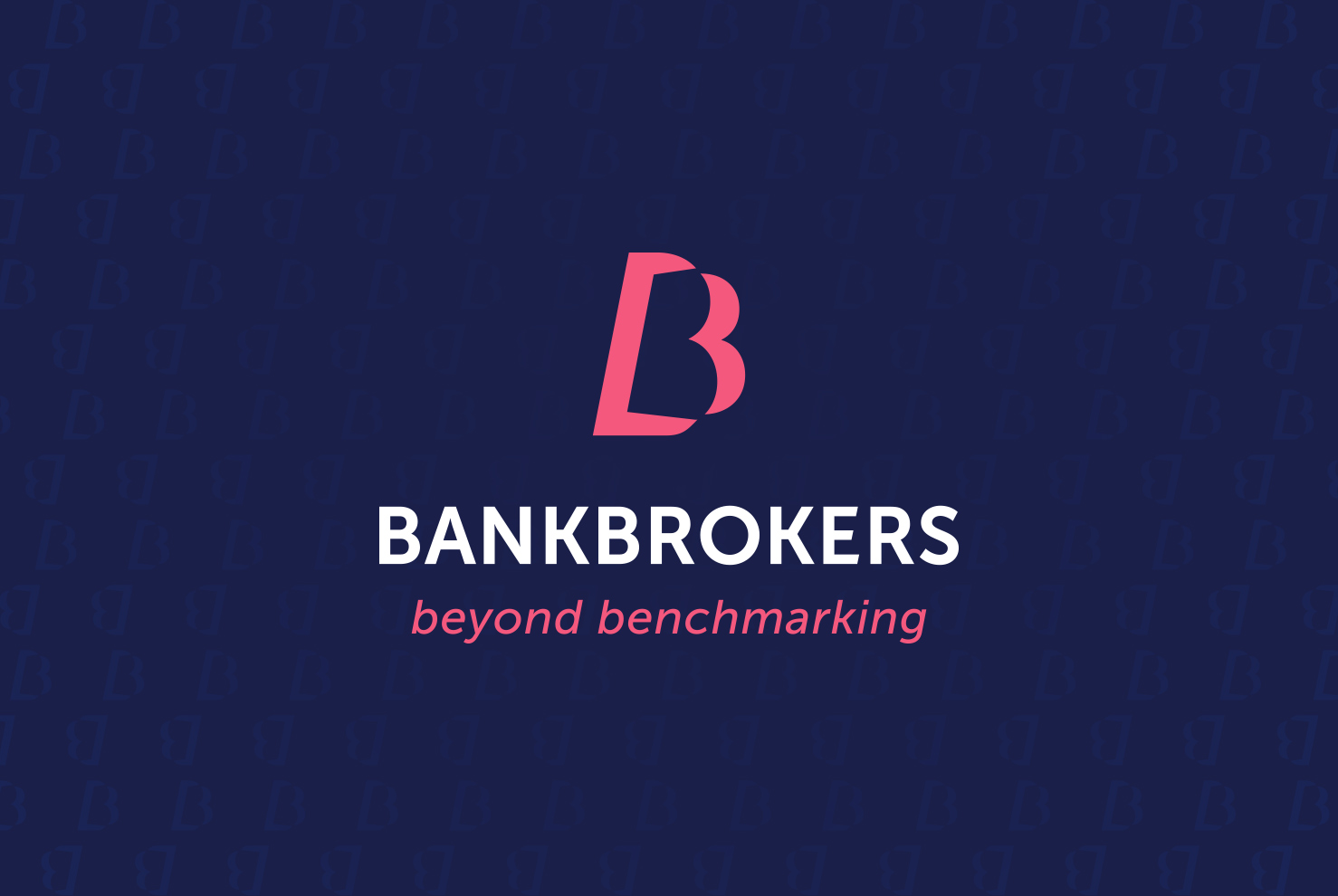
For Bankbrokers, transparency is key. We knew a forward-thinking organisation needed an equally innovative visual identity. We proposed changing the business name from Bank Brokers (two words) to Bankbrokers (singular).
The ‘Beyond Benchmarking’ tagline was crafted to reinforce their core offering while also conveying that their services extend into broader areas of financial advice and planning.
Their deep rooted values needed to be instilled into the new visual language. A deep blue, matching the profound fjords and star-studded skies, drawing inspiration from Bankbrokers’ Scandinavian heritage. Paired with a bright pink to highlight their unconventional approach and the distinction that has fueled their growth.
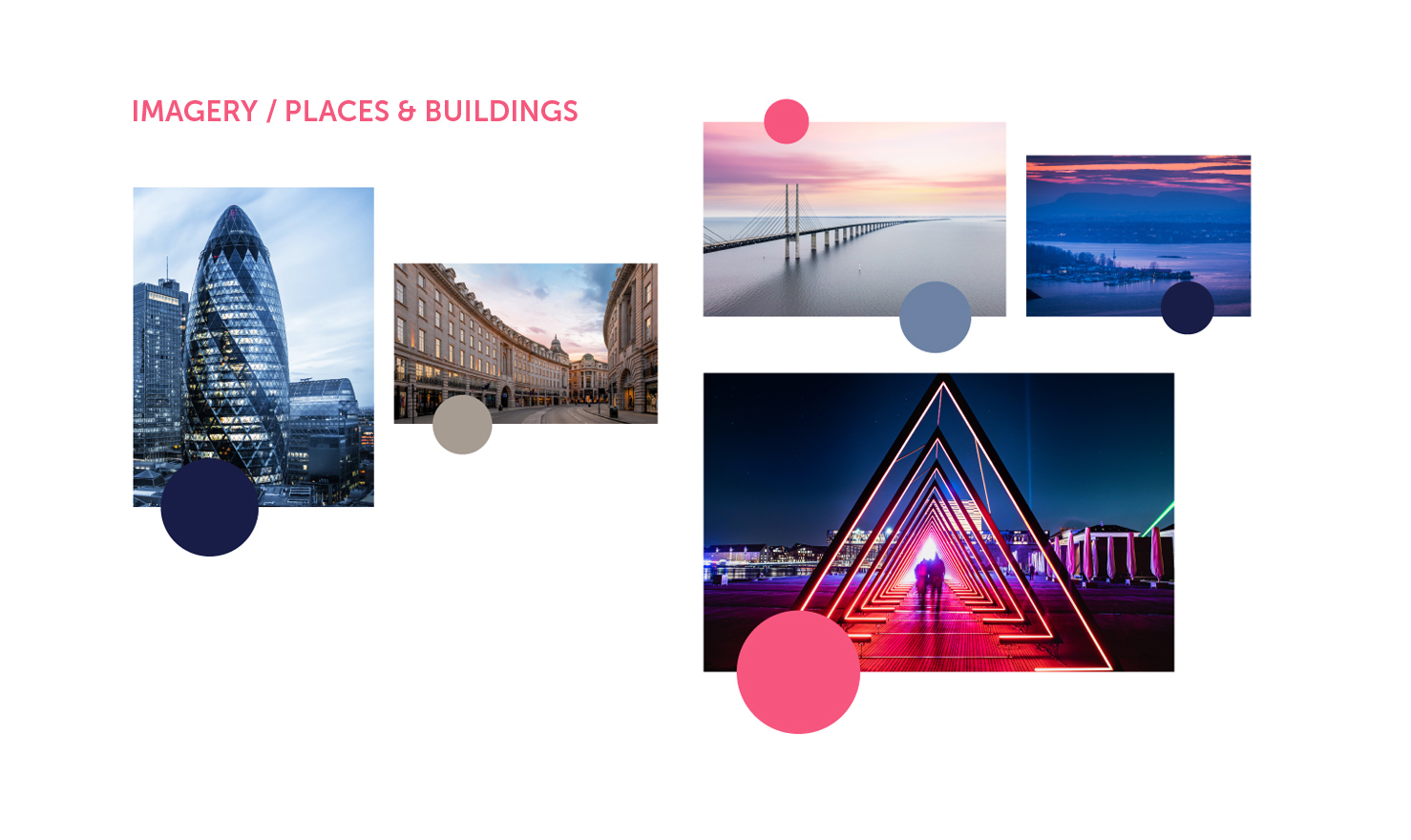
From their heritage, we introduced a suite of brand photography that is built around iconic global landmarks native to their markets.
The logo combined two B’s. Simply, a symbol representing a partnership of mutual interests, and a gateway — opening doors to new opportunities and avenues for growth.



The Outcome
With their refreshed brand identity, Bankbrokers now have a credible visual presence that perfectly aligns with the values and mission of their business and their belief in doing things differently.

"We wanted a new corporate identity and guidelines that really brought our brand to life and takes Bankbrokers to the next level. And The Brand Tailor certainly delivered. The group board and I are delighted with our new identity. I'd highly recommend The Brand Tailor for highest quality and sensible pricing."