Our Approach
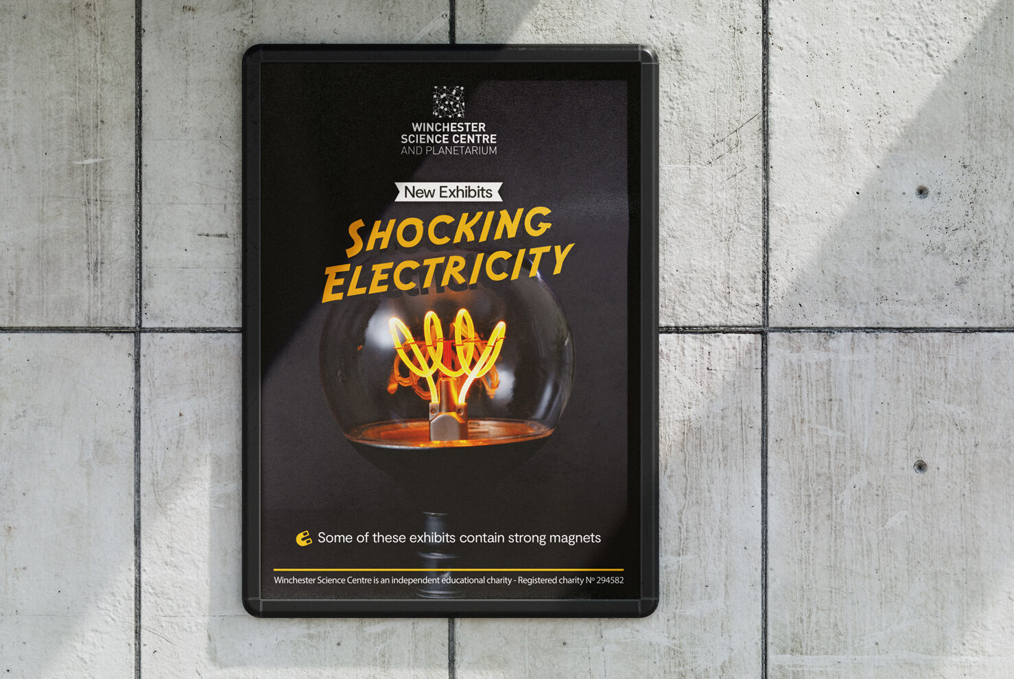
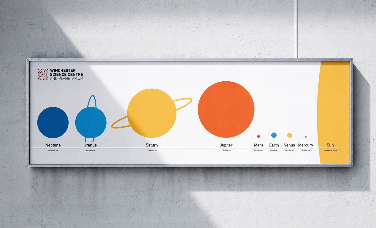
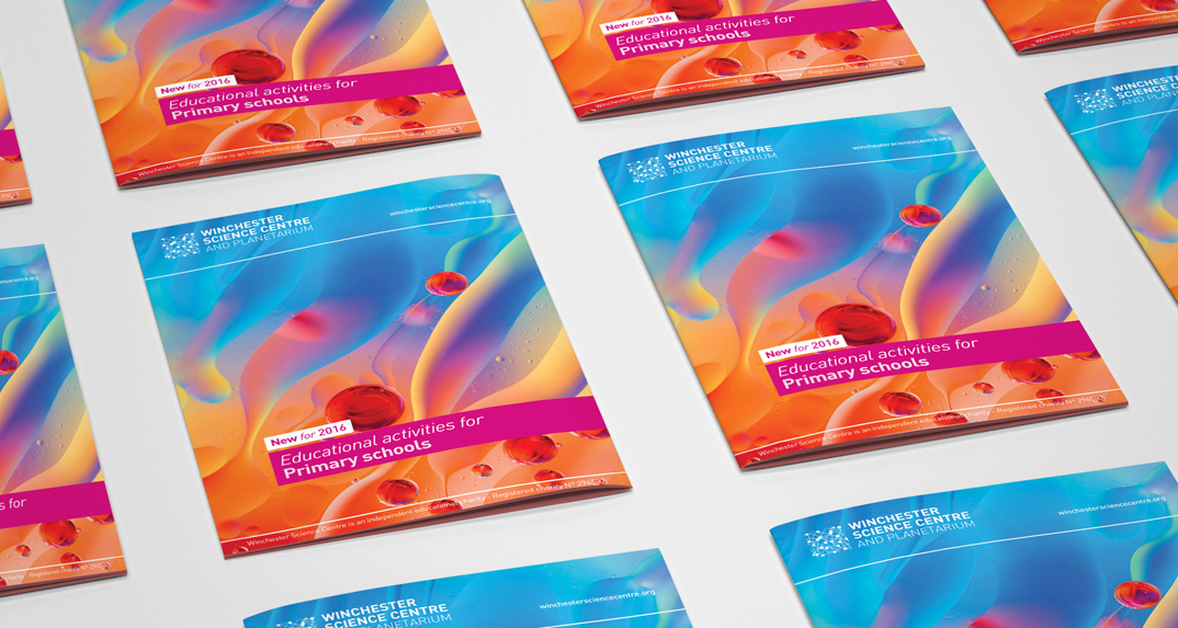
Previously known as Intech, we began a pivot to the new identity as Winchester Science Centre. To complement this name change, we introduced a new suite of brand colours to encourage inclusion for all, and broaden the centre’s appeal.
And we then infused these colours into every touchpoint, assigning each colour a meaning – Cyan blue polo shirts for the front of house staff, deep blue for the planetarium team, orange for the corporate functions and pink for the education team – lending it a practical, as well as an aesthetic purpose.
For Winchester Science Centre’s new logo, we took inspiration from synapses – the place in the brain where neurons connect and communicate with one another. Not only visually engaging, the logo also subtly reinforces the centre as a destination for scientific connections, encounters, and discovery, strengthening the brand’s core message through its most prominent visual asset.